Game 30 itself:
Saints, despite having a pretty pants season overall, still reached the 2024 playoffs.
And somehow only lost by one point, in golden point extra time, to a Warrington team who'd had a pretty solid season overall.
A Warrington team we'd lost to twice, 10-24 and 16-2 (or a combined score of 12-40)
Full match report here: https://www.saintsrlfc.com/2024/09/28/spirited-saints-beaten-in-golden-point/
Going through the data visualisation for this game, the 30th and last game of the season.
There were 7 point scoring moments for Saints.
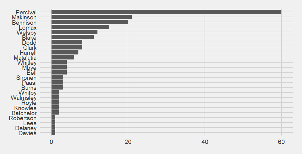
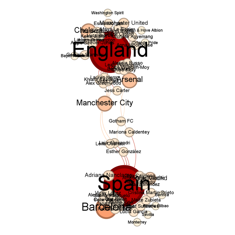
Who scored for Saints in Game 30?
( Under the cut )
There is something very apt about there being a Tommy Makinson special in his last game for Saints.
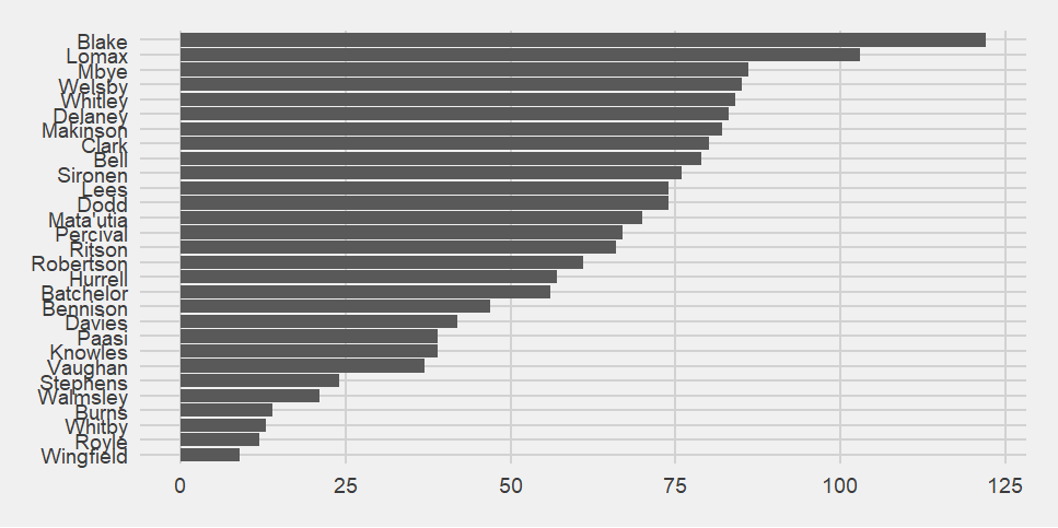
How many point-scoring moments the players were present for?
( Under the cut )
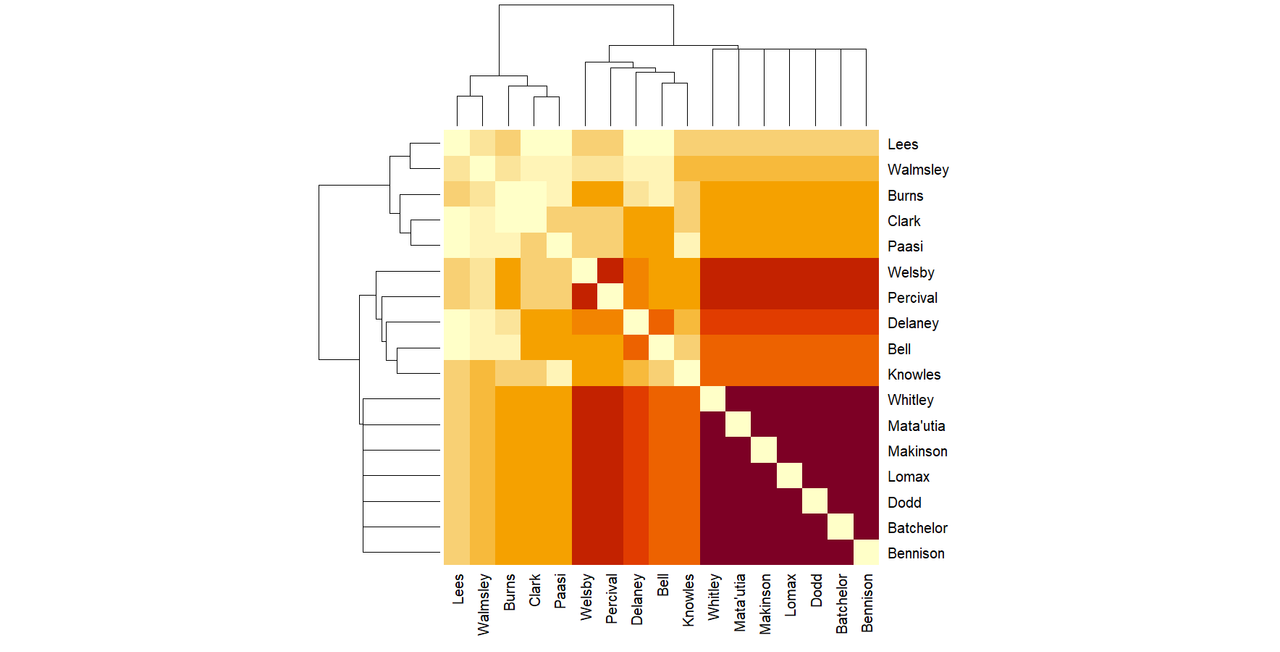
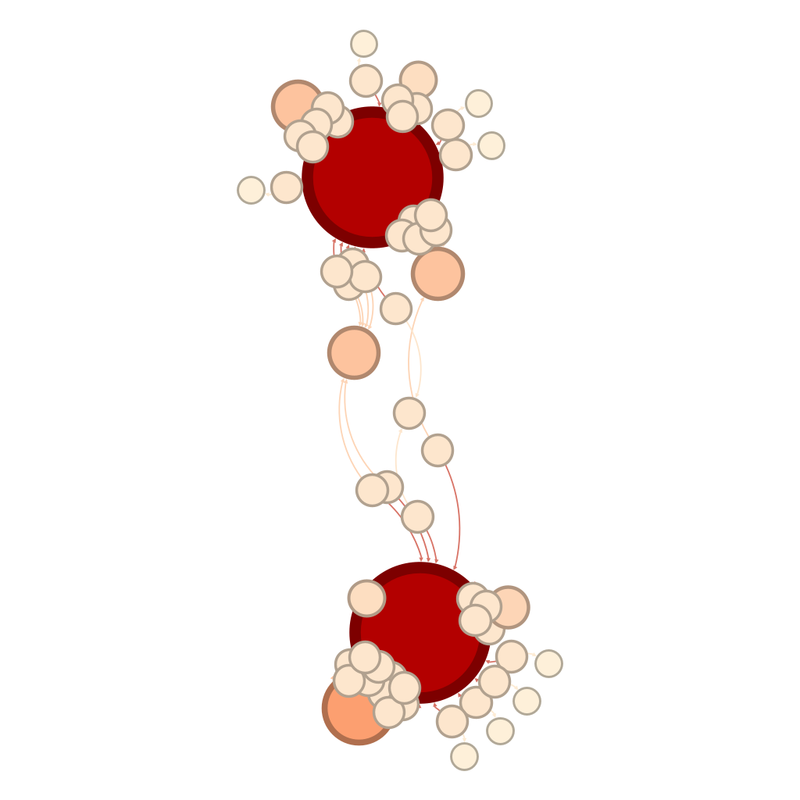
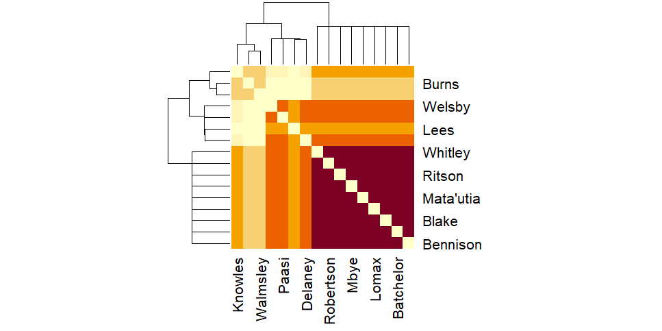
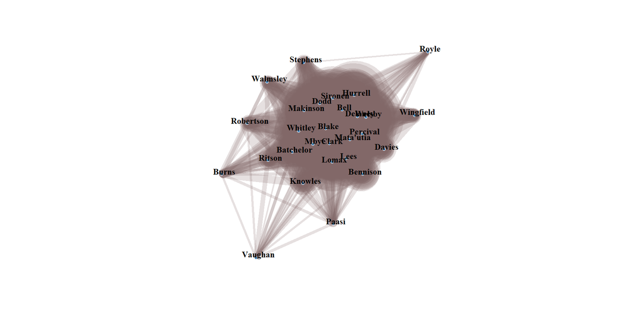
Which Saints players are together when Saints score?
( Under the cut )
Only 10 players are on the network graph.
( Under the cut )
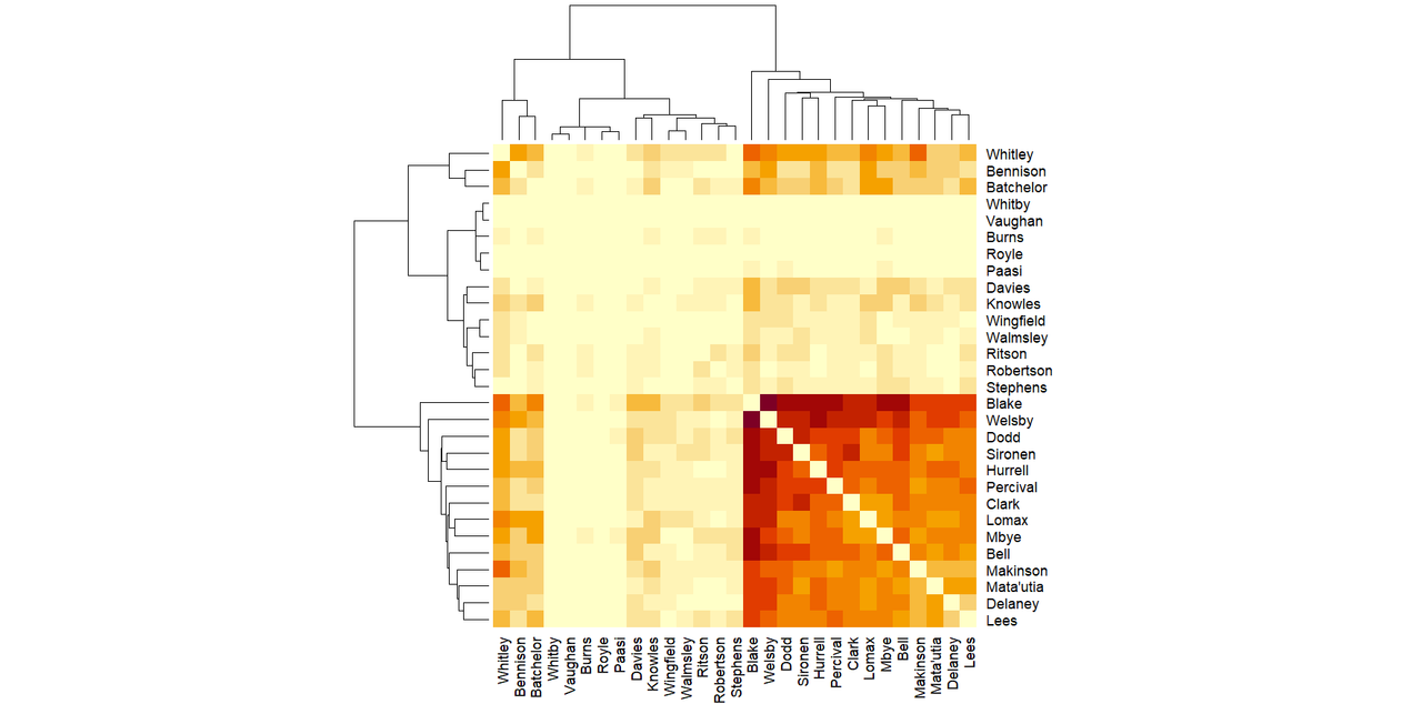
The 10 players are the ones in the dark purple patch in the matrix graph.
Looking at which players were present when Saints conceded:
There were 8 point-conceding moments.
( Showing which players were present for those )
The who is present when Saints concede matrix does the same thing that the scoring matrix does, where it doesn't put all the players in the same colour together.
( Under the cut )
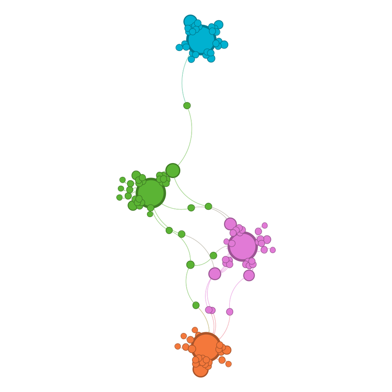
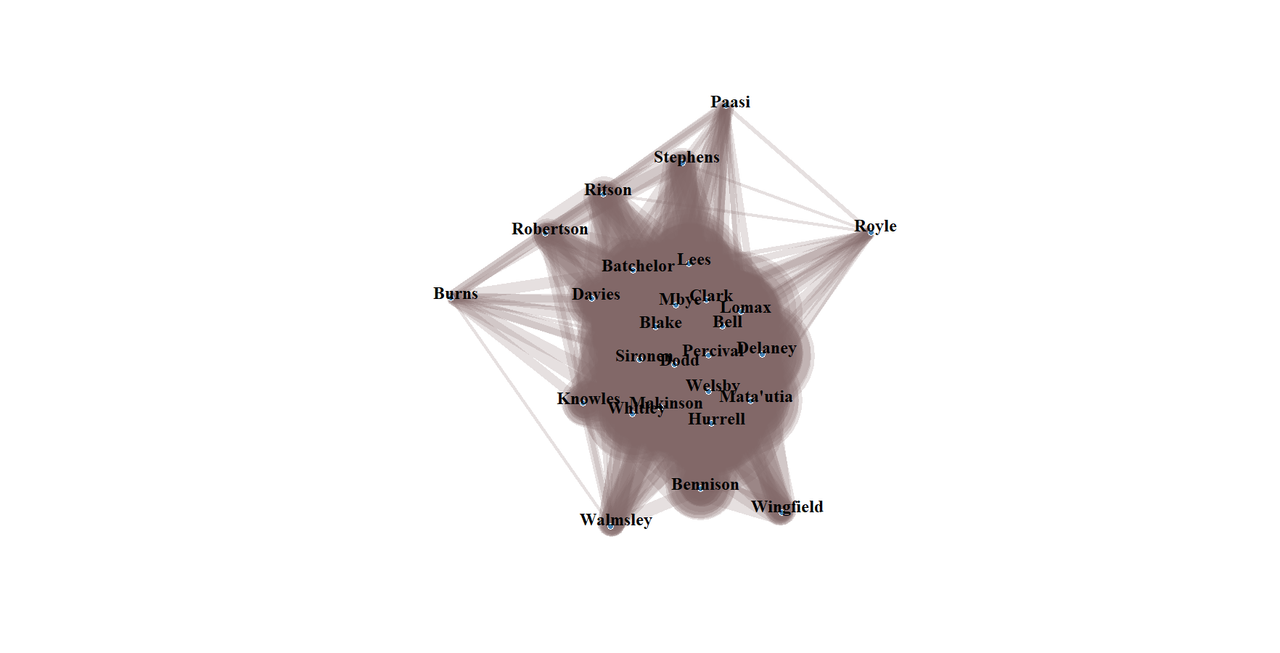
There are only 9 players on the concession network graph.
( Under the cut )
Rounding up the whole season
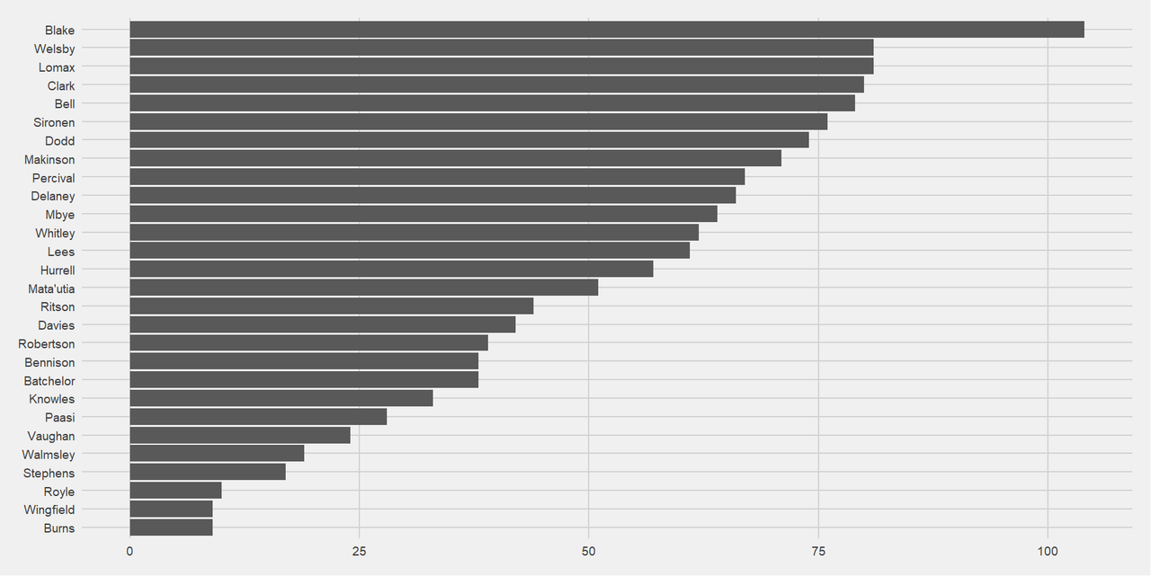
210 point-scoring moments scored
148 point-scoring moments conceded
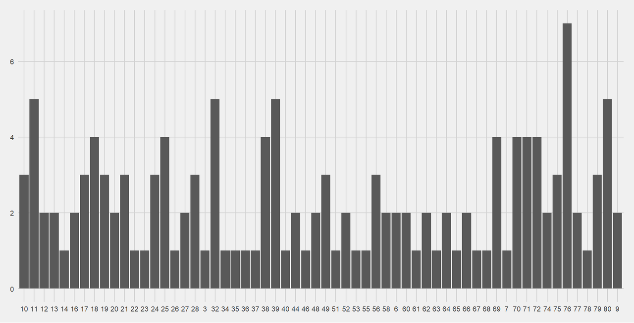
When do Saints score:
( Under the cut )
Unsurprisingly, Percival is way in the lead, because as well as scoring tries, he's also Saints's kicker. That's also, I think, why Bennison is that high, because he also kicks when Percival can't.
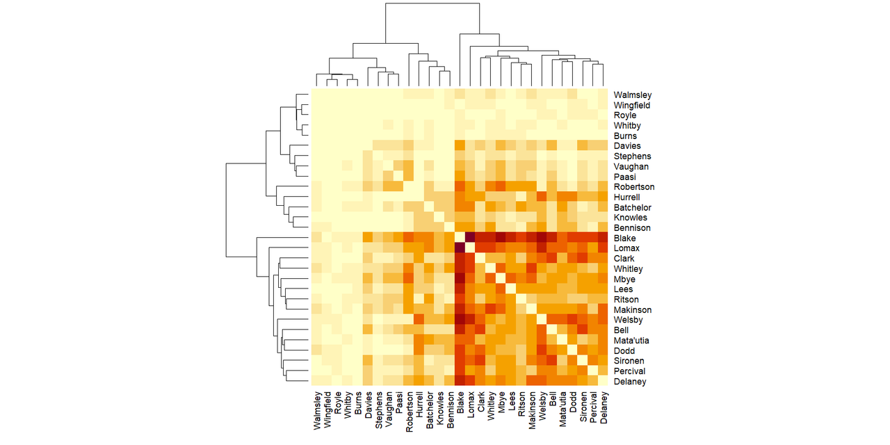
Who is present when Saints score?
( Under the cut )
It is clear that there's the very often present, then a chunk of often present, followed by the injured and their replacements.
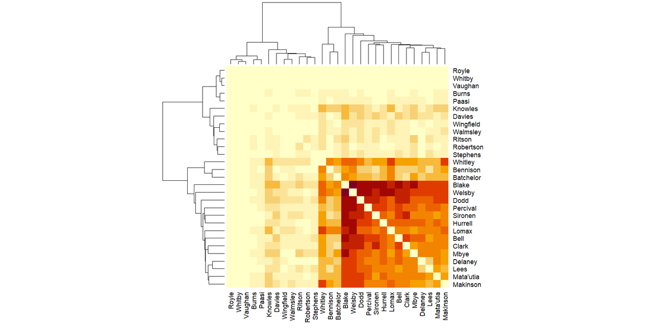
An interesting visualisation I haven't shared before, because I wasn't quite sure what it added, but I'm sharing now because as an end of season piece is when players are present at point-scoring moments.
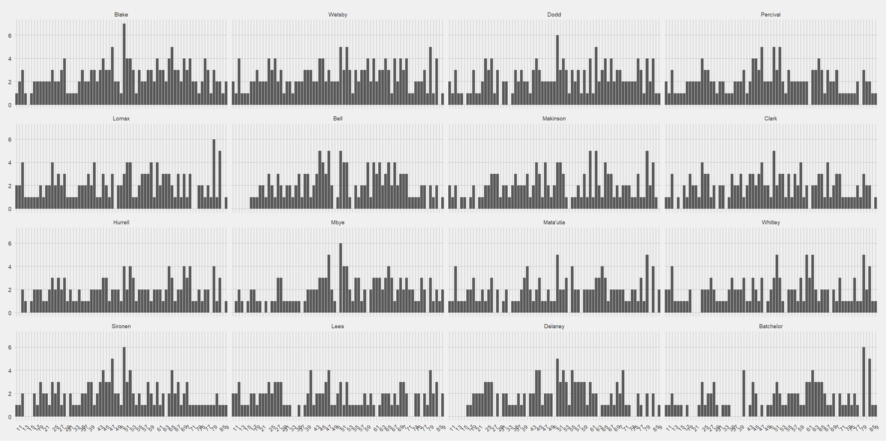
I'm not quite sure how to interpret it, but it's interesting that the graph shapes can almost be grouped into clusters. The clusters aren't based on position, or anything obvious like that.
Looking at the which players are together when Saints score matrix at the end of the year. Following game 30, the shape has changed significantly. Where previously it had gone (radiating up from the bottom right) darkest, most often together area, then paler and paler as you move up or to the left, now there's a medium dark border at the upper left as well. This cluster has to be players who play together often when Saints score, but not as often with the darkest bottom right cluster.
( Under the cut )
I know that Knowles, Bennison and Batchelor all had either injuries, suspensions or are first reserve, which means it makes some sort of sense, but it's interesting that the pattern has only come out right at the end of the season.
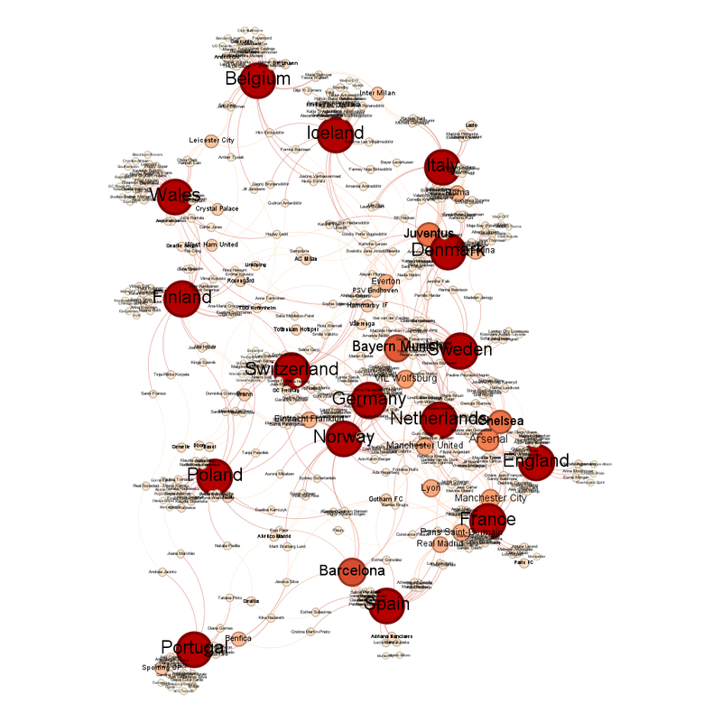
The equivalent network graph looks like this:
( Under the cut )
Looking at points conceded, this is when Saints concede.
( Under the cut )
There is no obvious pattern.
Who is present when Saints concede?
( Under the cut )
Here is the shape of when the players were present when Saints conceded.
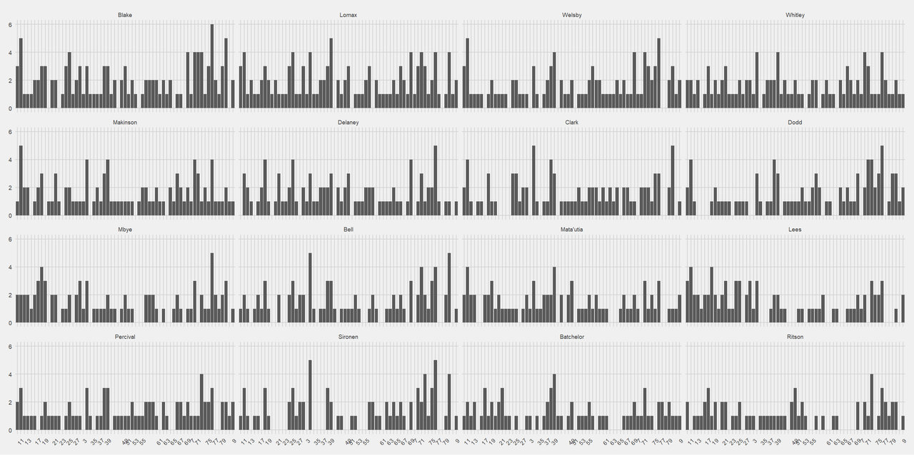
There is less of a pattern than in the equivalent figure for when players were present when Saints scored.
This is what the matrix for who is present when Saints concede.
( Under the cut )
The edges between the different areas of "played together" have got a lot fuzzier in this one over time. It still looks very much like the top left quarter of a mosaic of the sun.
Interestingly, the "dark top and left border" that the "point-scoring moments" equivalent developed is not present here.
The equivalent network graph looks like this:
( Underneath the cut )
Comparing players's position on the "present when Saints score" vs their position on the "present when Saints concede" graphs - in a purely ranking based analysis not the number they were present for, there's some interesting numbers.
The players with the greatest difference between present when Saints score vs when they concede are:
Hurrell and Percival were present for relatively fewer concession moments than scoring moments.
Whitley and Delaney were present for relatively fewer scoring moments than concession moments.
I am sure that's skewed slightly but interesting none the less.
2024 Summary:
I think, taking 2024 and 2025 into consideration, as a Saints fan I have to accept that this is one of the rough (ish) parts we take with the smooth. For whatever reason, Saints have not been playing like themselves (except in fits and starts like *that* try against Leeds in the playoffs in 2025 - https://www.bbc.co.uk/sport/rugby-league/articles/cn95qgeyn3lo).
Lack of results for Saints always worries me. Now with the IMG rankings nonsense (https://en.wikipedia.org/wiki/IMG_Grading_for_the_British_Rugby_Football_League), it worries me more, because Saints's supporter base is never going to be huge because of the size of the town. There's us, and Wigan, Leigh, Warrington and Widnes within a 40 minute driver and Oldham and Salford not much further out, so limited chance for expansion. So our "fandom" (yuck!) score will always have a ceiling, as will our ability to diversify our income streams, while the thing Saints the club do well (community work) counts for the least.
We need to do well to maintain our ranking.
As always, I am pleased to see Saints bring on young players, for instance Harry Robertson who got his debut in the 2024 away match against Wigan has gone on to be the Super League Young Player of the year in 2025.
I am very sad about some of the players who left at the end of 2024, even if it made sense for people at their various stages of life - https://www.seriousaboutrl.com/st-helens-confirm-seven-player-exits-with-one-major-name-omitted-from-list-97627/
What did I get from the season-long data visualisation project?
Not what I expected, which is a good reason to have done the project.
I was expecting a clearer separation between the players who were played often and those who weren't, because if you asked me as an external viewer I know who I would have put in each of those groups.
The data tells me I was wrong on my placement.
In terms of point-scoring, it highlighted the people I expected, and how high Bennison is really highlights the importance of conversion kicking.
I was hoping to see a pattern in when players played e.g. these two are our props for minutes 0-20, 21-40, 41-60 and 61-80, but that didn't happen, even before the injury disasters.
I did see how important the non-first team players are to covering for those injuries because you could see players moving in and out of the network graphs over the course of the season.
Experiment definitely worth doing.
If you have enjoyed reading these, the following charities are definitely worth contributing to:
The Steve Prescott Foundation - https://www.steveprescottfoundation.co.uk/
Motor Neurone Disease Foundation - https://www.mndassociation.org/get-involved/donations/rob-burrow
Saints, despite having a pretty pants season overall, still reached the 2024 playoffs.
And somehow only lost by one point, in golden point extra time, to a Warrington team who'd had a pretty solid season overall.
A Warrington team we'd lost to twice, 10-24 and 16-2 (or a combined score of 12-40)
Full match report here: https://www.saintsrlfc.com/2024/09/28/spirited-saints-beaten-in-golden-point/
Going through the data visualisation for this game, the 30th and last game of the season.
There were 7 point scoring moments for Saints.
Who scored for Saints in Game 30?
( Under the cut )
There is something very apt about there being a Tommy Makinson special in his last game for Saints.
How many point-scoring moments the players were present for?
( Under the cut )
Which Saints players are together when Saints score?
( Under the cut )
Only 10 players are on the network graph.
( Under the cut )
The 10 players are the ones in the dark purple patch in the matrix graph.
Looking at which players were present when Saints conceded:
There were 8 point-conceding moments.
( Showing which players were present for those )
The who is present when Saints concede matrix does the same thing that the scoring matrix does, where it doesn't put all the players in the same colour together.
( Under the cut )
There are only 9 players on the concession network graph.
( Under the cut )
Rounding up the whole season
210 point-scoring moments scored
148 point-scoring moments conceded
When do Saints score:
( Under the cut )
Unsurprisingly, Percival is way in the lead, because as well as scoring tries, he's also Saints's kicker. That's also, I think, why Bennison is that high, because he also kicks when Percival can't.
Who is present when Saints score?
( Under the cut )
It is clear that there's the very often present, then a chunk of often present, followed by the injured and their replacements.
An interesting visualisation I haven't shared before, because I wasn't quite sure what it added, but I'm sharing now because as an end of season piece is when players are present at point-scoring moments.
I'm not quite sure how to interpret it, but it's interesting that the graph shapes can almost be grouped into clusters. The clusters aren't based on position, or anything obvious like that.
Looking at the which players are together when Saints score matrix at the end of the year. Following game 30, the shape has changed significantly. Where previously it had gone (radiating up from the bottom right) darkest, most often together area, then paler and paler as you move up or to the left, now there's a medium dark border at the upper left as well. This cluster has to be players who play together often when Saints score, but not as often with the darkest bottom right cluster.
( Under the cut )
I know that Knowles, Bennison and Batchelor all had either injuries, suspensions or are first reserve, which means it makes some sort of sense, but it's interesting that the pattern has only come out right at the end of the season.
The equivalent network graph looks like this:
( Under the cut )
Looking at points conceded, this is when Saints concede.
( Under the cut )
There is no obvious pattern.
Who is present when Saints concede?
( Under the cut )
Here is the shape of when the players were present when Saints conceded.
There is less of a pattern than in the equivalent figure for when players were present when Saints scored.
This is what the matrix for who is present when Saints concede.
( Under the cut )
The edges between the different areas of "played together" have got a lot fuzzier in this one over time. It still looks very much like the top left quarter of a mosaic of the sun.
Interestingly, the "dark top and left border" that the "point-scoring moments" equivalent developed is not present here.
The equivalent network graph looks like this:
( Underneath the cut )
Comparing players's position on the "present when Saints score" vs their position on the "present when Saints concede" graphs - in a purely ranking based analysis not the number they were present for, there's some interesting numbers.
The players with the greatest difference between present when Saints score vs when they concede are:
Hurrell and Percival were present for relatively fewer concession moments than scoring moments.
Whitley and Delaney were present for relatively fewer scoring moments than concession moments.
I am sure that's skewed slightly but interesting none the less.
2024 Summary:
I think, taking 2024 and 2025 into consideration, as a Saints fan I have to accept that this is one of the rough (ish) parts we take with the smooth. For whatever reason, Saints have not been playing like themselves (except in fits and starts like *that* try against Leeds in the playoffs in 2025 - https://www.bbc.co.uk/sport/rugby-league/articles/cn95qgeyn3lo).
Lack of results for Saints always worries me. Now with the IMG rankings nonsense (https://en.wikipedia.org/wiki/IMG_Grading_for_the_British_Rugby_Football_League), it worries me more, because Saints's supporter base is never going to be huge because of the size of the town. There's us, and Wigan, Leigh, Warrington and Widnes within a 40 minute driver and Oldham and Salford not much further out, so limited chance for expansion. So our "fandom" (yuck!) score will always have a ceiling, as will our ability to diversify our income streams, while the thing Saints the club do well (community work) counts for the least.
We need to do well to maintain our ranking.
As always, I am pleased to see Saints bring on young players, for instance Harry Robertson who got his debut in the 2024 away match against Wigan has gone on to be the Super League Young Player of the year in 2025.
I am very sad about some of the players who left at the end of 2024, even if it made sense for people at their various stages of life - https://www.seriousaboutrl.com/st-helens-confirm-seven-player-exits-with-one-major-name-omitted-from-list-97627/
What did I get from the season-long data visualisation project?
Not what I expected, which is a good reason to have done the project.
I was expecting a clearer separation between the players who were played often and those who weren't, because if you asked me as an external viewer I know who I would have put in each of those groups.
The data tells me I was wrong on my placement.
In terms of point-scoring, it highlighted the people I expected, and how high Bennison is really highlights the importance of conversion kicking.
I was hoping to see a pattern in when players played e.g. these two are our props for minutes 0-20, 21-40, 41-60 and 61-80, but that didn't happen, even before the injury disasters.
I did see how important the non-first team players are to covering for those injuries because you could see players moving in and out of the network graphs over the course of the season.
Experiment definitely worth doing.
If you have enjoyed reading these, the following charities are definitely worth contributing to:
The Steve Prescott Foundation - https://www.steveprescottfoundation.co.uk/
Motor Neurone Disease Foundation - https://www.mndassociation.org/get-involved/donations/rob-burrow