Euro 2024 Network Diagram - Quarterfinals
Jul. 4th, 2024 11:10 pmOkay, so Austria are out, as I suspected they would be. For the second Euros in a row, a team they beat in the group stage has gone further than them. But at least it took this absolute stunner of a save for Turkey to beat Austria - https://x.com/EURO2024/status/1808266570327634063
Of the clear predictions, the diagram was 4/4, and the diagram was part of why I wasn't surprised by Italy or Austria's losses. (I have a series of theories about why the UK press always underestimates Turkey, they are all rude.)
So, what does the diagram look like now?
As expected, the outlying teams all lost, so there's now only the central core teams left.
Looking at the unlabelled diagram,
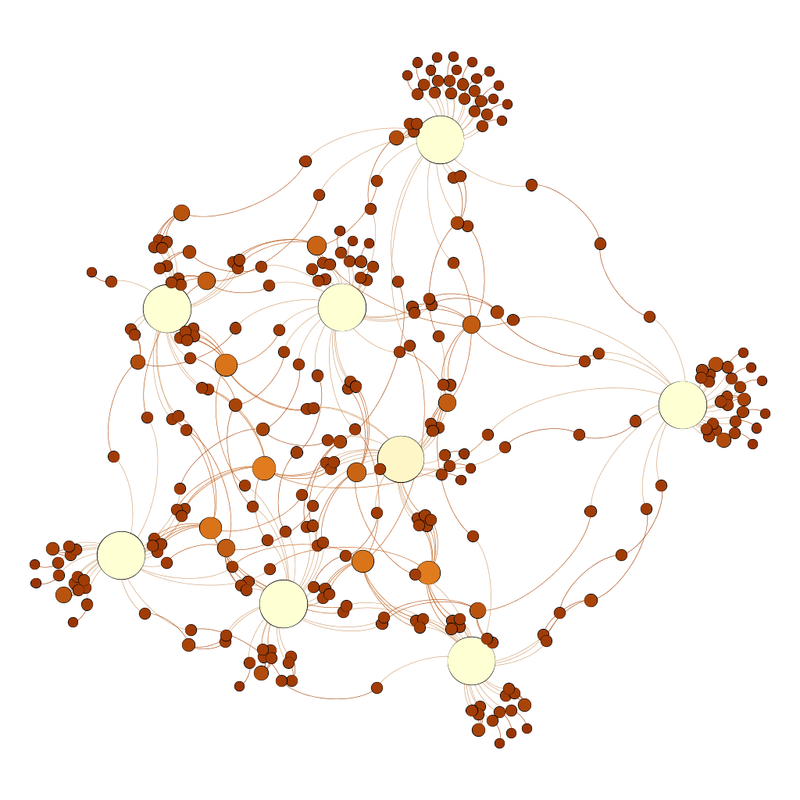
the central clump is now not as clumped, and one team sticks out to the right.
Labelled, it looks like this:
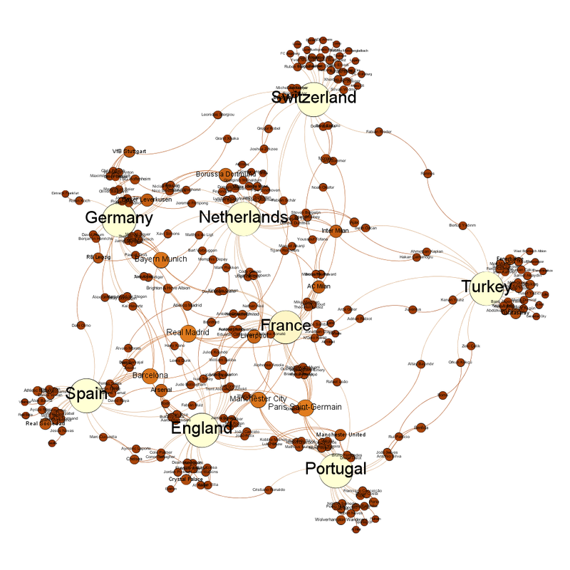
France are the team closest to the centre, while AC Milan are the club team closest to the centre.
The club teams with the most representatives left are Real Madrid and Paris Saint-Germain with 10, Bayern Munich, Barcelona and Manchester City with 9, then Borussia Dortmund and Liverpool with 7 (stop giggling back there about that linkage).
Inter Milan have been significantly reduced, not just because of Italy going out but also because they had several players in other teams that have been eliminated.
All the teams are their own community in the community views.
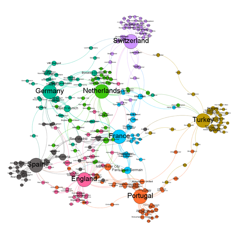
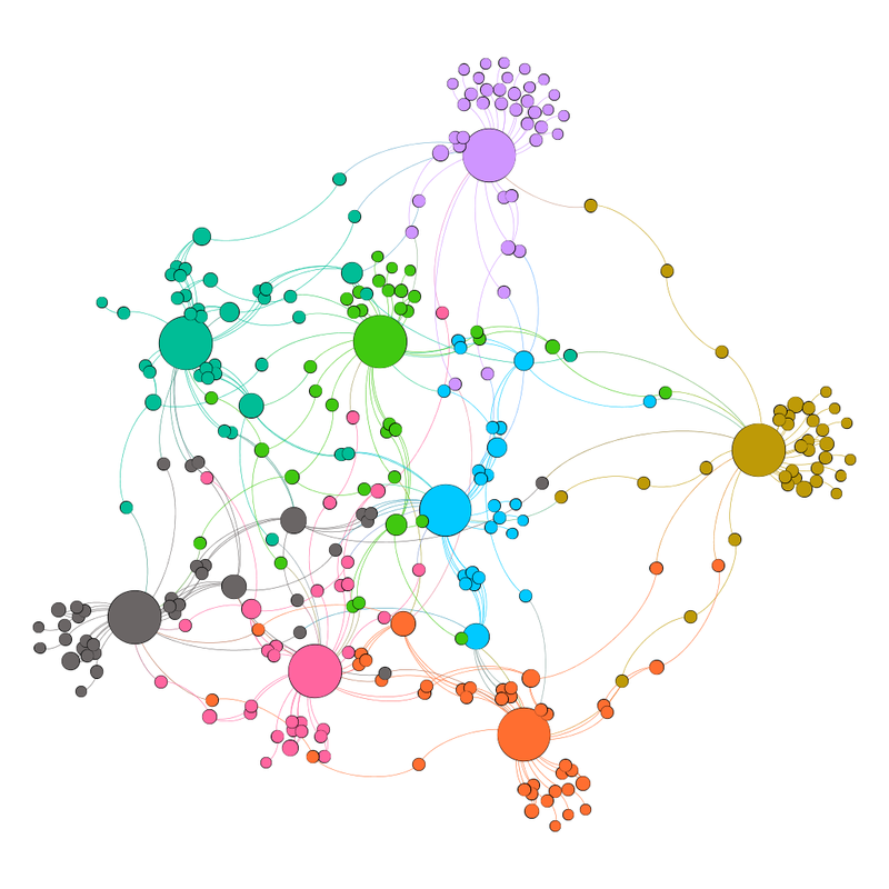
I can understand why Inter Milan are French in the community view, what with Italy going out, but Manchester City and Manchester United being Portuguese intrigues me.
Predictions from this (and the reason why I'm writing this while watching the election coverage so it's out before tomorrow):
Spain vs Germany - Diagram says Germany, just
Portugal vs France - Diagram says France
England vs Switzerland - too close to call
Netherlands vs Turkey - Diagram says Netherlands (this one is the one I think could be an upset. This Turkey team have a vibe.)
Of the clear predictions, the diagram was 4/4, and the diagram was part of why I wasn't surprised by Italy or Austria's losses. (I have a series of theories about why the UK press always underestimates Turkey, they are all rude.)
So, what does the diagram look like now?
As expected, the outlying teams all lost, so there's now only the central core teams left.
Looking at the unlabelled diagram,
the central clump is now not as clumped, and one team sticks out to the right.
Labelled, it looks like this:
France are the team closest to the centre, while AC Milan are the club team closest to the centre.
The club teams with the most representatives left are Real Madrid and Paris Saint-Germain with 10, Bayern Munich, Barcelona and Manchester City with 9, then Borussia Dortmund and Liverpool with 7 (stop giggling back there about that linkage).
Inter Milan have been significantly reduced, not just because of Italy going out but also because they had several players in other teams that have been eliminated.
All the teams are their own community in the community views.
I can understand why Inter Milan are French in the community view, what with Italy going out, but Manchester City and Manchester United being Portuguese intrigues me.
Predictions from this (and the reason why I'm writing this while watching the election coverage so it's out before tomorrow):
Spain vs Germany - Diagram says Germany, just
Portugal vs France - Diagram says France
England vs Switzerland - too close to call
Netherlands vs Turkey - Diagram says Netherlands (this one is the one I think could be an upset. This Turkey team have a vibe.)