redfiona99: (Thinking)
2025-08-14 07:03 pm

How I make those Gephi diagrams

Written for [personal profile] shauna@social.coop on Mastodon

Please don't read any further if you want to maintain the belief I know what I'm doing

I was original entranced by this post - https://gephi.org/users/quick-start/

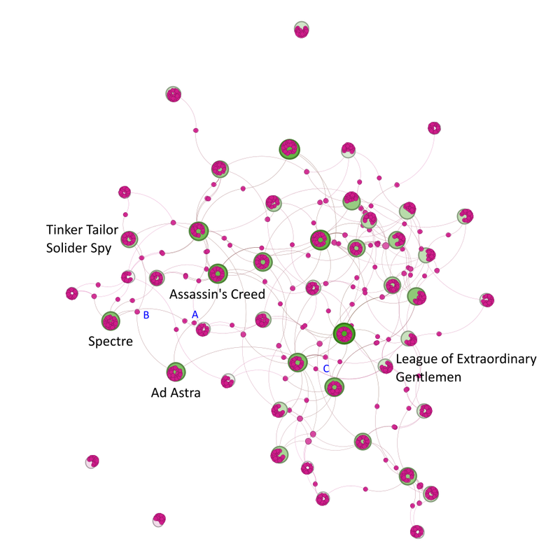
So I downloaded Gephi and then looked for some data to interrogate. Initially, I wanted to look at how the players at Euro 2012 were interconnected - https://fulltimesportsfan.wordpress.com/2012/06/08/finalised-diagram/

It's pretty much been the same process ever since, with some learnings that have been incorporated in the oh my goodness 13 years!

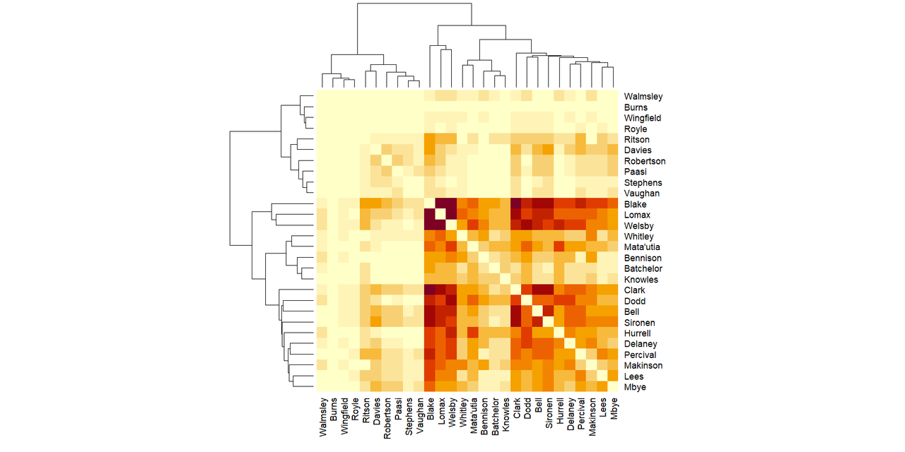
Information source - I use the Wikipedia squad pages. This is why you'll occasionally see notes about "delayed because of" and a warning that the data is taken from Wikipedia so may not be accurate. The club team a player plays for is the one most likely to be wrong, especially for competitions that are between seasons. (The strange places I've ended up at on Wikipedia because of edit wars about which club someone plays for.) It is, to an extent, worse for the rugby union ones because players move at the end of the season, not the start of the next.

Because I do the input (and the removals when teams are out) by hand, I go through the national teams starting with group A and move downwards. This is why, if there is a delay in the teams in group A naming their squads, it causes a huge knock on effect. (The time Italy delayed their squad announcement till ~ 7 pm on the night of the deadline for a game show caused significant cursing because they were the first team in group A and I couldn't start till they did.)

The larger the event and the bigger the squads obviously, the longer it takes.

If you can python (I can't, one day I will learn etc), James Ashford wrote a really nice post on how to do all of this with Python - https://james.ashford.phd/2023/08/25/analysing-the-2023-fifa-womens-world-cup-with-graph-theory/

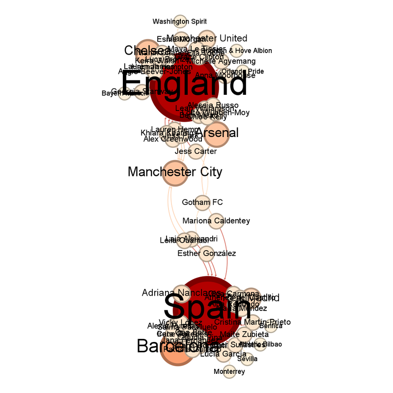
Me, I manually add things into Gephi. Sometimes this means I notice things (like the number of Zambian players playing in the Kazakh Women's League, or that there is a Saudi Women's League - https://fulltimesportsfan.wordpress.com/2023/07/22/womens-world-cup-2023-group-stage-network-diagrams/)

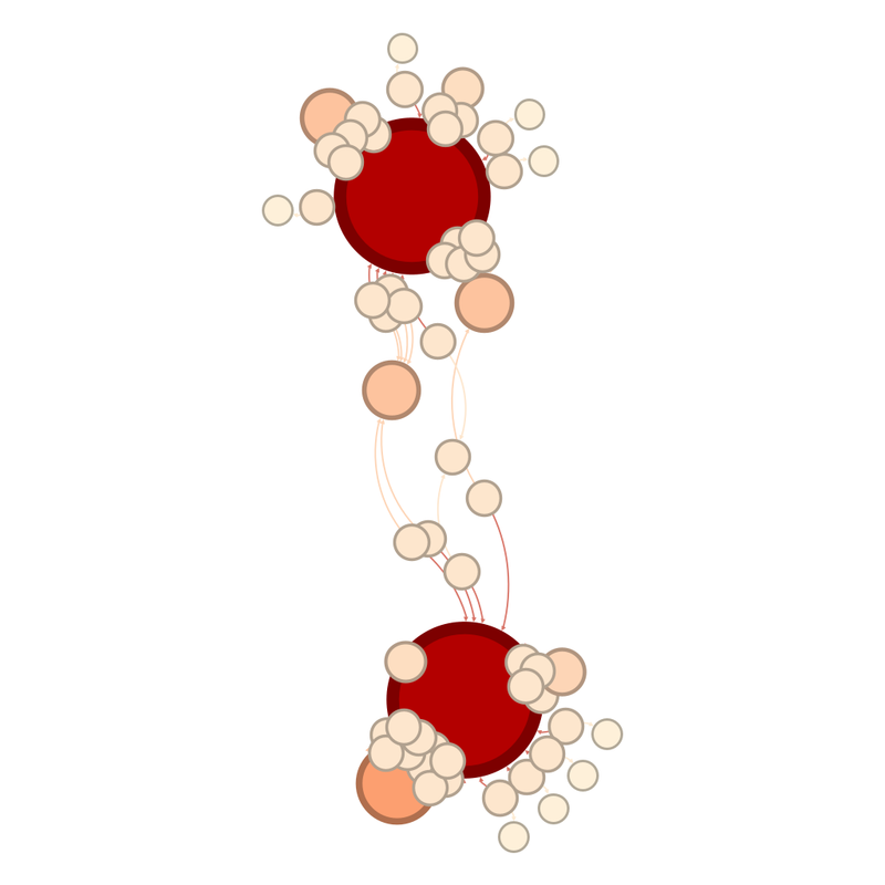
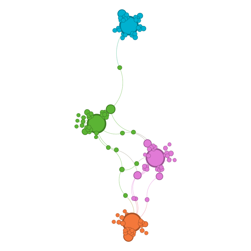
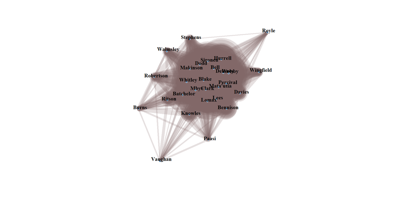
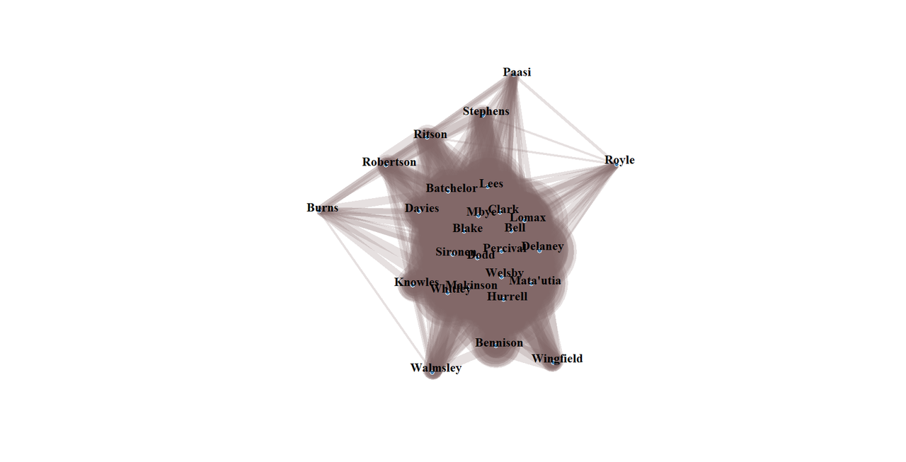
I use the player as the source and the national or club team as the target. I've experimented with using both directed and undirected links, and it doesn't make much of a difference.

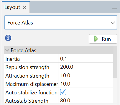
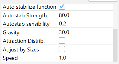
There are other layouts, but I like the way force atlas looks. (Force atlas works okay with this size data set. For significantly larger ones, Yifan Hu is easier)

I start with the pre-set values, increasing the repulsion strength if the teams crash into each other.

Screenshot of Gephi settings.  It starts with Force Atlas, with inertia set at 0.1, repulsion strength at 200, attraction strength at 10, maximum displacement at 10, the auto stabilise function ticket, and autostabilisation strength at 80.

Screenshot of the bottom half of the Gephi settings, autostability sensibility is set at 0.2, gravity at 30, attraction distribution is not ticked, nor is adjust by size, and speed is at 1.

I like to add each player individually, because one of the things I enjoy is seeing the shape and positions change with each addition, but I'm sure making more links at the same time would make it go quicker.

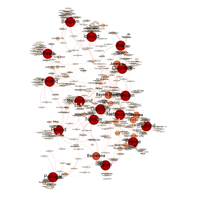
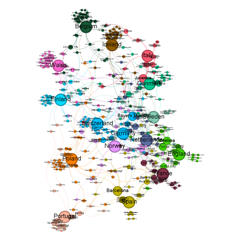
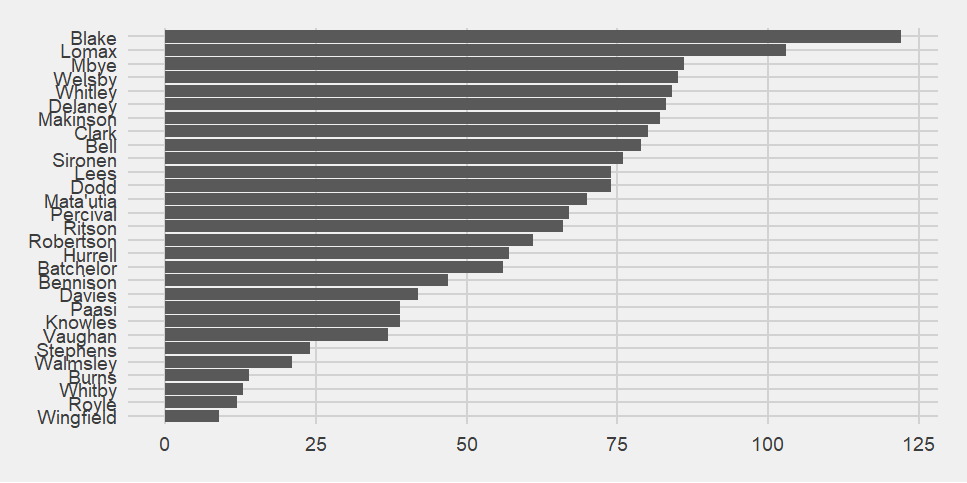
For the colour and the size of the circles, I keep it really simple and stick to number of degrees. For size, I set minimum at 10 and maximum at 50. I find it's large enough to see the small changes with each player and clear enough when I've oopsed and not attached a player to the right national team. Or the Wiki page is wrong and hasn't taken off the players that didn't make it to the final squad. Or France have decided to only pick 25 players when they could have picked 26 for who knows what reason. I also like it for the rugby union one (because they have unlimited replacements for squad injuries) because it creates a subtle gradation for each injured player.

Colour is slightly more complicated. I like to try and use either the tournament colours or the colours of the host country flag but it's not possible to change the Gephi pre-sets (or at least not as far as I can find out) so sometimes I have to go with nearest to those. I know to not complain about free software but it's the reason I keep looking to see if there's a way to do something similar in R.

I keep link width at 1.

For closest to the centre, I use the zoom function, and the degree function to get the number of players.

When teams get knocked out, I remove the players manually, hence why I try to keep the teams in order when I add them. Again, you get some fun shape and pattern changes that way.
redfiona99: (Default)
2025-08-04 09:20 pm

Fandom Data Viz

The fic that reached 1000 was Ideas and Actions, NC-17 Randy/Trish fic written for the 50 Kinky Ways fest (I promise I will try to finish more of those). It was entirely written by the imp of the perverse to the prompt "cross-dressing" because I was bored that all the other fics I'd seen on the theme in the fest were men cross-dressing as women.

The chart it affected is the fudge factor one, unfortunately, rather than the proper one, so the two charts (all fics and split into shippy and non-shippy) now look like this:

Under the cut )

Shippy fic is clearly more likely to reach 1000 hits at this point.

(Unless something very unexpected happens, I would not expect an update on this figure for some time. Unexpected is reboots [or Batista appearing in films].)
redfiona99: (Default)
2025-08-03 10:02 pm

100 Things Related - Now with "Ad Astra" added

Finally posting another "100 Great Scenes In Not So Great Films" entry means I can update the charts too.

Network graph, all the interesting changes are described in the text below.

This is one where I feel bad because the people who are linking Ad Astra to other films are not the problems with this film or the others.

3 people link Ad Astra to 4 other films.

Ad Astra is linked to Assassin's Creed by producer Arnon Milchan, who is the pink circle underneath the blue A.

Hoyte van Hoytema (the pink circle to the right of the blue B), who is an excellent cinematographer, and did I mention how good his work was in Ad Astra, links Ad Astra to Spectre and Tinker Tailor Soldier Spy.

Robert Alonzo who works in stunts and is the pink circle to the right of the blue letter C, links Ad Astra to League of Extraordinary Gentlemen. That was the link that really changed the shape of the overall diagram pulling League of Extraordinary Gentlemen in from it's point on the far right of the diagram into the centre.
redfiona99: (Default)
2025-07-30 10:42 pm

Withdrawals from the 2025 Tour de France

Sadly, this year, I haven't been able to watch any of the Tour.

Yes, this is entirely due to my cousin refusing to let me put it on the TV at the weekend and RL bad thing meaning I didn't have the time to watch the highlights at lunchtime.

However, I did find the time to do the withdrawal stats.

Looking at the Kaplan Meier charts.

Kaplan Meier for 2025 )

While I was compiling the chart, I did start to wonder whether this was an exceptionally kind year in terms of attrition (if you're not Jasper Philipsen or Filippo Ganna, my poor Nutella child). I will try and borrow a copy of Prism to get the numbers but the comparison itself makes it clear that there was less attrition than normal but not by much.

The Kaplan Meier line for the 2025 Tour de France compared to previous races going back to 2020.  2025 (dark blue line) is the one with the fewest withdrawals, finishing with 0.875 still in (87.5%), 2023 (light blue) is the next highest at about 0.85, then 2020 (orange) at about 0.83, then 2024 (green) at 0.80, 2022 (grey) at about 0.78 then 2021 (mid blue) is the lowest at 0.76

I don't know whether that's because the first "week" this year was 10 days long, because the 14th of July fell on a Monday (very necessary Casablanca clip here - https://youtu.be/HM-E2H1ChJM?si=Sadu7MugvhdwDhXC).

Withdrawals by team )
23 teams took part in the race.

The withdrawals seem reasonably balanced.

6 teams had 2 riders withdraw - Soudal QuickStep, Total Energies, Lotto, Alpecin-Deceunnick, Ineos Grenadiers and XDS Astana.
5 teams had no one withdraw - Arkea - B&B Hotels, Israel Premier Tech, Picnic Post NL, Tudor and Visma - Lease A Bike.

(And I know it's because sponsorship is hard to find, but do the team names need to be that long).

Because they withdrawals are evenly spread, in the Kaplan Meier diagram split by teams, there's no sudden drops. It looks very like a plait.

Below the cut )

Further evidence of it being an unusually non-attritional race, despite them having a stage with a sprint finish up the Ventoux - https://velo.outsideonline.com/road/road-racing/tour-de-france/highlights-tour-de-france-stage-16-2025, is that no one stage stands out as having more withdrawals.

Pie chart of withdrawals by stage )

Looking at withdrawals by type by week:

3 pie charts under the cut )

Ignoring that week 1 was 10 days ... the really interesting things are:

1 - No over the time limit withdrawals at all
2 - The pattern is almost symmetrical

The number of withdrawals by type is pretty even, 48% were mid-stage abandonments, 52% were did not starts.

Pie chart below the cut )

Type of Abandonments split by week )

Since Did Not Start withdrawals are mostly "help, the damage has caught up with me" withdrawals, that pattern makes sense.
redfiona99: (Default)
2025-07-26 02:09 pm

Euro 2025 - Network Graph for the Final

The figures are obviously very simple now that there are only two teams.

Network graph of the two teams in the final.  There are two large red circles representing England and Spain.  Of the smaller paler circles, there is one very large one next to the bottom of the two large red circles.  There are two more smaller, paler circles closer to the top of the two large red circles.

The same graph, but labelled:

Network graph of the two teams in the final, labelled.  There are two large red circles representing England and Spain.  England is the circle at the top of the diagram, Spain the circle at the bottom.  Of the smaller paler circles, there is one very large one next to the bottom of Spain.  It is Barcelona.  There are two more smaller, paler circles closer to England.  They are Arsenal and Manchester City.

Gotham FC are the club team closest to the middle.

Barcelona, unsurprisingly, have the most players left, with 10. The teams with the next most players remaining are Chelsea, Arsenal and Manchester City with 6.

Manchester City, Arsenal and Gotham FC are guaranteed to have a player on the winning side.

The community view gives less information when we're down to two teams so I haven't shared that.

It's a final to look forward to.
redfiona99: (Default)
2025-07-21 08:58 pm

Euro 2025 - Semifinals Network Graphs

As suggested (https://fulltimesportsfan.wordpress.com/2025/07/14/euro-2025-quarterfinal-network-diagrams/), the sheer number of Spanish and Italian players playing for Barcelona and Italy respectively did distort the graph.

It's also distorting the semifinal graphs which are much narrower and elongated than usual.

Two network graphs under the cut )

There is a pleasing simplicity to the community view, with each country being its own community.

Non-labelled version of the community view network graph.  The larger circles stand for each national team.  One of them, in mid-blue, is separated at the top, with very few connections to the other three.  Two more are in the middle (green and pink) and then the fourth team is at the bottom and orange.  The shape is an elongated diamond with curved edges.  The team at the top has a smaller circle at its top left, a club team.  There is another smaller circle at the top right of the leftmost one of the two national teams in the middle.  There is one link from it to the national team at the top.  Similarly, the national team at the bottom has one of the larger circles coming off it, bottom middle.

Labelled version behind the cut )

Unsurprisingly, the largest of the paler red circles reflects the club teams with the most representatives left, Barcelona with 10, Bayern Munich with 9 and Juventus with 8.

Germany are the national team closest to the centre, because of Italy pulling them up. For the same reason, Bayern Munich are the club team closest to the centre.

I have seen all of the semi-finalists except England play (and I am banned from watching them lest I be an ill omen).

I am guessing that Spain will beat Germany but that German team have a certain admirable determination about them.
redfiona99: (Default)
2025-07-14 07:29 pm

Euro 2025 - Quarterfinal network diagrams

The group stage diagrams and predictions based on them can be found here - https://fulltimesportsfan.wordpress.com/2025/06/29/euro-2025-group-stage-network-diagrams/

How did the group stage predictions go?

From group A, I predicted Norway and Switzerland would qualify for the quarterfinals, and I was right, even if it involved extra time goals in the decider.

Group B, I predicted Spain and AN other, which I am aware is a bit of a "the sky is blue" sort of prediction.

Group C, I predicted Germany and Sweden

Group D, I predicted Netherlands and one of England and France, which was oh so wrong.

So out of 8, I am willing to call that about equivalent to 5/8.

With that in mind, here are the quarterfinal network diagrams

Four figures under the cut )

Sweden are the national team closest to the centre (just, vs. Norway). Either Lyon or Bayern Munich are the club team closest to the centre.

Barcelona are the team with the most representatives left in with 14, then comes Bayern Munich and Juventus with 13 then Chelsea with 12.

Predictions for the quarterfinals:

These are quite difficult because Italy and Spain are pulled out by how many of their players play for Juventus and Barcelona respectively, while Bayern Munich, and the players that play for them, are pulling together Sweden and Germany, and Arsenal and Chelsea are holding together England, Sweden and Norway.

Sweden vs England - Diagram says Sweden

Norway vs Italy - Diagram says Norway, plus every single women's football pundit keeps bewailing how often Italy somehow manage to screw up. On the other hand, Norway trip over their own feet also.

France vs Germany - Diagram says Germany just. Football fan says "ooooh".

Spain vs Switzerland - Remember how I said Barcelona pulled Spain out of the diagram. This really reflects that. Switzerland are far closer to the centre. On the other hand, there is no way I can see Switzerland beating this Spanish team.
redfiona99: (Default)
2025-07-04 09:36 pm

Euro 2025 Network Diagrams - An Update

Every time, I forget that the teams have up until their first game to make injury swaps. And because I try to get the figures ready in time for the first match that means I need to make an update now.

The unlucky players this time are:
Adelina Engman (Finland) withdrawing because of a thigh injury (https://yle.fi/a/7-10080591). Her replacement is Anni Hartikainen.

Luana Bühler (Switzerland) might win unluckiest, because she had to withdraw from a home tournament with a knee injury (https://www.football.ch/sfv/nationalteams/a-team-frauen/UWNL/news/frauen-nationalteam-luana-buehler-faellt-fuer-das-heim-turnier-aus.aspx). Her replacement is Laia Ballesté.

Chiara Beccari (Italy) is out with a thigh strain (https://total-italianfootball.com/womens-euro-2025-italy-beccari-out-injury-bergamaschi-in/). Her replacement is another Juventus player, Valentina Bergamaschi.

Martyna Brodzik (Poland) is out ill (https://pzpn.pl/federacja/aktualnosci/2025-06-22/zmiana-w-liscie-zawodniczek-powolanych-na-uefa-euro-2025). She has been replaced by Małgorzata Mesjasz. Because Mesjasz plays for AC Milan, this caused a fair amount of movement in the diagram.

The major changes to the diagram is that because of Poland moving up slightly, Germany and Norway have been split. The move has also pulled Italy in so they are directly above Denmark.

Network graph of the connections between the teams at Euro 2025.  It looks a lot like the map of France.  From the top left corner, along the top edge which is a descending diagonal line, are Belgium, Iceland and Italy.  Denmark are directly below Italy.  Sweden are directly below them.  England are down and to the right from them.  Diagonally down left from England are France, then Spain.  Portugal are in a straight line left from Spain.  Poland are above Portugal.  Finland are above them, then it is Wales, who are down and left from Belgium.  In the centre, slightly left from Sweden, are Switzerland, Germany, Norway and Netherlands.

In the community view, Switzerland and Germany are still together in one community but Sweden and England are now separate communities.

Same diagram as before, but this time coloured in by community view.  From the top left corner, along the top edge which is a descending diagonal line, are Belgium (dark green), Iceland (brown) and Italy (red pink).  Denmark (mid-green) are directly below Italy.  Sweden (mint green) are directly below them.  England (fake apple green) are down and to the right from them.  Diagonally down left from England are France (red brown), then Spain (olive yellow).  Portugal (salmon pink) are in a straight line left from Spain.  Poland (orange) are above Portugal.  Finland (electric blue) are above them, then it is Wales (shock pink), who are down and left from Belgium.  In the centre, slightly left from Sweden, are Switzerland, Germany (both mid-blue), Norway (lilac) and Netherlands (RAF blue).

The changes bring no clarity to any predictions.
redfiona99: (Default)
2025-06-29 04:55 pm

Euro 2025 Network Diagrams

Now in a slightly different format.

The Making Of:

UEFA saying teams had to announce their teams by the 25th of June meant that I have had plenty of time to make these diagrams. That the women's teams are limited to only 23 players also sped this along.

Interestingly, while coverage and interest in women's football had increased hugely, the Wikipedia pages are still updated much more slowly than the equivalent men's pages. I was making the diagrams and spotted that Italy had a much bigger and darker red circle than the other teams, and when I checked, it was because the Wikipedia page hadn't been updated following the cut from 27 players to 23.

The Diagrams:

Four diagrams below the cut )

Some Observations Based on the Diagrams:

Every country has at least one player playing for their home league, except Wales. Every country has at least one player playing abroad - for Italy it is literally only the one (Arianna Caruso for Bayern Munich).

It is not clear if Germany or Switzerland is the country closest to the centre. It is clear that Bayern Munich are the club team closest to the centre.

The club teams with the most players present are Barcelona with 17, Bayern Munich with 16, then Juventus and Chelsea with 14.

For most teams, the players are spread over several teams. The exceptions to this are Italy, Spain, Portugal and Germany, although with Germany it's less obvious when looking at the diagram because a number of non-German players also play for them. England are more weakly like that, with a lot of players from Chelsea, Arsenal and Manchester City.

The number of links between Italy and Denmark is due to the large number of Danish players playing in Italy, which might be related to similar patterns seen in the men's game. Danish acquaintance of mine used to complain players on had to be signed by Italian clubs to walk into the national team.

Having done this for women's tournaments before (see the 2022 version of this here - https://fulltimesportsfan.wordpress.com/2022/07/08/womens-euro-2022-network-diagrams-group-stage/), I'm slightly saddened that we seem to be losing those teams where the main team is the women's team; there's no players for Turbine Potsdam for instance, and only a few from London Lionesses, Paris FC and Madrid CFF. I don't want the increased interest in women's football to cause it to lose its history. (I still don't forgive the English Women's Super League for screwing over Doncaster Belles.)

Some of the old divisions still remain; Liverpool not giving a flying curse about it's women's team is reflected by there only being two Liverpool players present, both for Wales, compared to eight for Everton. Everton have always supported their women's team - when I was young, the only chance women in my area had of playing football properly was in their women's team.

One thing that might be affecting the clustering is the number of players who play for US teams. A country with a lot of club teams represented but not present itself doesn't usually happen, unless one of the big guns doesn't qualify (looking at you, so often, Italy).

I will be keeping an eye on Poland, particularly Emilia Szymczak who is 19 and plays for Barcelona B. If you're good enough to be picked up by Barcelona at that age ...

In terms of the community view, the national teams that group together are Sweden and England (because of Arsenal and Chelsea) and Switzerland and Germany (because of Eintracht Frankfurt, Bayern Munich and Wolfsburg). Switzerland and Germany being joined is really interesting given Germany's circle overlaps with Norway's, and yet those two aren't linked.

Predictions:

L likes me to try to predict the outcome of the games from this, and there is some correlation between closeness to centre and connectedness and doing better in tournaments. However, previous experience (https://fulltimesportsfan.wordpress.com/2023/08/03/womens-world-cup-2023-last-16-network-diagrams/) has shown that it doesn't work as well for women's football.

Because half the teams will be gone after the group stage, it's a lot harder to predict, and it makes the games so much more tense. Limiting it to 16 teams also means some of those groups are stacked - like group D - England, France, Netherlands and Wales. So that's the present World Cup holders, the winners of Euro 2022, the winners of Euro 2017 and the lowest ranked team in the competition.

Bon chance, Wales.

(Actually the diagram doesn't have them as separated from the other teams as I would have expected.)

Spain are the team that really confuses the diagram. I would expect them to be a lot more central, given I expect them to do well. It could be the number of players that also play for clubs with Portuguese players that is pulling them out there or potentially a sign that they may not do as well as expected.

Running purely off the diagram, the teams most closely clustered are Germany, Norway, Switzerland, Sweden, Netherlands, England, France, and then one of Denmark and Spain.

You'll notice that's 9 teams and only 8 go through.

If we take Switzerland and Norway from group A, that leaves 3 more groups where it is unclear.

For group B, it is unclear because only Spain are in that central core, and they're barely in it.

For group C, as Germany and Sweden are closer to the centre than Denmark, I will predict that these are the teams that will get through.

For group D, D for death, that logic can't work because England and France are a similar distance from the centre of the cluster. My best prediction - that group is going to be tight.
redfiona99: (Default)
2025-06-24 05:15 pm

Saints Ahoy - Game 27 and the 2024 Season to Date

Game 27 was a dismal loss to Warrington. Dismal because Warrington, and even more dismal because the only points that Saints scored was from a penalty.

It seemed to be that sort of game (https://www.saintsrlfc.com/2024/09/07/saints-beaten-by-warrington-at-the-halliwell-jones-stadium/), with lots of their points also coming from penalties and 3 yellow cards - 2 for them, 1 for us. Yup, the team with fewer cards lost.

The "who is present together when Saints concede in game 27" matrix indicates quite clearly who the "missing" player was, enveloping Matty Lees in one group even though his line is paler than the players around him. Yes, I wonder who got the yellow card!

Matrix chart of who is present together when Saints conceded in game 27.  Of interest is the second darkest group (they are in orange), containing Welsby, Paasi, Lees and Delaney.  The line for Lees is a paler orange because he was not present with that group every time Saints conceded.  On this occasion, it is a mark of shame because he had been yellow carded, which Warrington exploited to score twice.

Looking at the season to date:

When do Saints score?

Under the cut )

Bennison is now equal to Welsby in the "who scores for Saints?" bar chart. Game 27 was when Welsby made his return from injury.

Bar chart under the cut )

Who is present when Saints score, up to game 27?

Bar chart under the cut )

To my mind, the interesting thing here is you've got the three present the most (Blake, Welsby and Dodd), followed by one slowly declining cluster (Mbye, Hurrell, Sironen, Percival, Bell, Lomax, Clark, Makinson, Lees, Whitley, Mata'utia and Delaney) then a drop to the bottom cluster who also slowly reduce in number present as you go down the list (Batchelor, Bennison, Knowles, Davies, Ritson, Stephens, Robertson, Walmsley, Wingfield, Paasi, Burns, Royle, Vaughan and Whitby).

In the matrix of who plays together most often when Saints score, now updated to game 27, the top left border of Whitley, Bennison and Batchelor, first seen in game 26 is still there.

Below the cut )

The network graph looks like this under the cut )

When do Saints concede?

Below the cut )

The "who is present when Saints concede" chart has a very different shape to the "who is present when Saints score" bar chart. While that has three distinct sections, this chart has Blake and Lomax in the lead (because they have played a lot of minutes), then a slowly degrading curve covering most of the other players, then a small section of the infrequently present players at the bottom.

Bar chart of who is present when Saints concede.  Blake is far in the lead, followed, some way behind by Lomax, then Mbye in third.  Mbye is at the start of that sloping curve I mentioned above.  The small section of infrequently present players are Stephens, Walmsley, Burns, Whitby, Royle and Wingfield.

The concede matrix looks very similar to last time, except fuzzier once more. It's interesting that as there's more data, the boundaries between the groups get weaker, then they suddenly pop back into strong colours, then weaken again (and so on).

Matrix chart of players together when Saints concede.  The darkest area, the players most often together when Saints concede, is in the bottom right hand corner and includes Blake, Lomax, Clark, Whitley, Mbye, Lees, Ritson, Makinson, Welsby, Bell, Matautia, Dodd, Sironen, Percival and Delaney.  The next most commonly together section is much paler, with occasional swirls of darker colour.  It includes Davies, Stephens, Vaughan, Paasi, Robertson, Hurrell, Batchelor, Knowles and Bennison.  The top and left-most is the palest and least often together.  It includes Walmsley, Wingfield, Royle, Whitby and Burns.

Another interesting this is that, although the shape is similar, some of the players have moved section e.g. Ritson has moved from the middle group to the darkest group, in just one game.

The network graph is the same shape but has shifted about 15 degrees clockwise. Last time I suggested that players were either being sucked into the centre or moving out. It was being sucked in because they're all much closer now.

Beneath the cut )

Despite the piles of data, there are still changes, and the players brought in as other players were injured are now clearly part of the main group due to number of matches played.

It's been interesting to watch that exchange of players coming in and out of the matchday squad.

There may be a slight delay as I work on the Women's Euro 2025 network graphs. I am already seeing some interesting patterns.
redfiona99: (Default)
2025-06-18 08:18 pm

Saints Ahoy - Game 26 and the Season to Date

Game 26 was Saints away at Huddersfield, which Saints won (https://www.saintsrlfc.com/matches/2024/first-team/huddersfield-giants-v-saints-2024-09-01/?swcfpc=1)

The biggest news to my mind was Morgan Knowles coming back. I was not alone in this opinion - https://www.sthelensstar.co.uk/sport/24556400.morgan-knowles-brought-saints-return/

The St. Helens Star, a biased source I grant, said, "He missed the best part of three months with a groin issue – a period that coincided with the beginning of Saints’ picking up other injuries and then subsequent run of defeats." (https://www.sthelensstar.co.uk/sport/24556400.morgan-knowles-brought-saints-return/)

It also points out he then missed 3 games due to a ban for a high tackle.

Saints lost 7 of the 11 games Knowles missed.

The really terrifying thing is that 2024 was Knowles's 10th year with Saints. Time flies, eh?

While the game was a victory for Saints, it also highlighted a worrying trend for yellow cards (although I forgive Noah Stephens entirely).

Bennison having to do the kicks reassured me in the "there is another" with regards to kicks if Percival is off the pitch.

None of match-specific pictures are all that interesting so I'll move on to the season to date diagrams.

Seeing Bennison shoot up the "who scores for Saints?" diagram after just one game shows how important the kicker is.

Under the cut )

Robertson is now on the list after scoring his first ever try for Saints. Overall 24 different players have scored either a try or conversion for Saints in 2024.

When do Saints score?
Under the cut )

Who is present when Saints score?

Under the cut )

The matrix of who is present when Saints score is interesting:

Matrix of who plays together when Saints score.  The darkest part of the diagram (the players who play together most often when Saints score) is in the bottom and right part of the diagram and goes about halfway up.  It contains Blake, Welsby, Dodd, Sironen, Hurrell, Percival, Clark, Lomax, Mbye, Bell, Makinson, Matautia, Delaney and Lees.  Next up and out is a noticeably paler section of Davies, Knowles, Wingfield, Walmsley, Ritson, Robertson and Stephens.  Then is the palest area, of Whitby, Vaughan, Burns, Royle and Paasi.  Oddly, there is a dark border around the top and left hand side (of Whitley, Bennison and Batchelor, which suggests they are often together when Saints score but not with the others.  Probably this is due to extended absences from the team for all 3.

Normally it would go darkest (most often together) in the bottom right hand corner and paler (less often together) as it moves up and to the left.

This time, that pattern happens but then there's a suddenly dark border along the top and left which consists of Whitley, Bennison and Batchelor, suggesting Saints score when they are on the pitch together. Which makes some sort of sense because Batchelor definitely missed some matches with an injury.

The equivalent network graph is slightly different again.

Network graph of who is present together when Saints score.  There is the central core, with a secondary ring around it.  On the second ring, clockwise, starting at 3 on the clock are Wingfield, Davies, Bennison, Knowles, Ritson, Robertson, Walmsley and Stephens.  Sticking out top right is Royle, bottom centre is Paasi, bottom left is Vaughan, left but up a bit Burns.

It's interesting that two ways of presenting the same data give subtly different results.

There's no real changes to the pattern of the "who scores against Saints" diagram so I haven't included it.

The last 10 minutes of the game is still when Saints are most vulnerable.

Bar chart under the cut )

Blake also leads the "who is present when Saints concede?" chart

Bar chart under the cut )

The matrix diagram of who is present together when Saints concede is not as pretty as it was after game 25 (https://fulltimesportsfan.wordpress.com/2025/06/11/saints-ahoy-game-25-and-the-2024-season-to-date/). It think it's because the "curls" of more often together in the mid-section are less well defined than they were last time.

Under the cut )

Unlike the "who is present when Saints score?" matrix and network graphs, the concession network graph mostly matches the matrix diagram.

Under the cut )
redfiona99: (Default)
2025-06-11 08:57 pm

Saints Ahoy - Game 25 and the 2024 season to date

Game 25 in 2024 was an unfortunate loss to Hull KR - https://www.saintsrlfc.com/matches/2024/first-team/saints-v-hull-kr-2024-08-24-2/?swcfpc=1

I don't care that Hull KR were the coming force, I don't like losing to them. Blake getting a yellow card and then Makinson getting a red didn't help, although I'm pleased that Whitby got his first try and conversion (and on his debut too).

The game-specific figures don't really add much so I'm not sharing them.

Whitby's two point-scoring moments move him to the bottom of the middle of the "who scores for Saints?" diagram.

Under the cut )

That might be a bad sign that either Saints's scoring pool wasn't diverse in 2024, or that they needed to score more points.

When do Saints score?

Under the cut )

That Saints didn't score while Blake or Makinson were off the pitch due to their cards means they maintain their positions on the "Who is present when Saints score?" chart.

Under the cut )

The matrix chart is back to being dark in one corner (bottom right) fading as it goes up and left.

Under the cut )

The network graph, interestingly, doesn't quite match. Whitby and Vaughan aren't present on the network graph, and Bennison is clearly outside the "frequently plays together" central blob, while he's in the second darkest area of the matrix chart. Davies has moved the other way.

Network graph of which Saints players are present together when Saints score.  There are two less connect groups outside the main blob.  At the top, from left to right, are Burns, Robertson, Ritson, Stephens, Paasi and Royle.  Royle has more connections to the main blob that to the other players at the top.  Burns is similarly out on the other side.  At the bottom, from left to right are Walmsley, Bennison and Wingfield.  Bennison is either about to be subsumed into the main blob or about to escape from it.

In an amusing coincidence, both matches vs Hull KR in 2024 featured Hull KR having the same number of point-scoring moments.

Bar chart under the cut )

When do Saints concede?

The evidence for "in the last 10 minutes" is really building up.

Underneath the cut )

Who is present when Saints concede?

Under the cut )

Understandably, because he is also present for the most scoring moments, Blake is top of this chart. There's a large drop off until you hit Lomax in second.

The "who is present when Saints concede" matrix looks like the top left quadrant of a Roman mosaic of the sun. If nothing else, it's pretty.

Matrix chart of who is present when Saints concede.  The overall view is very mosaic-y.  The orange areas mixing with the pale areas make it look like the top left quadrant of a Roman mosaic of the sun.  It is a regular regimented pattern.

I think it looks like that because of how often Blake played with some of the "second most frequently playing" cluster of players (Robertson, Davies, Ritson, Vaughan, Stephens, Paasi, Batchelor, Knowles and Bennison).

The network graph is less spread out than equivalent one for point-scoring moments, with most players being in the central blob. The players that stick out are Wingfield, Walmsley, Royle, Whitby and Burns. Although there are a ring of players that are either coming out of the main blob or being eaten by it (Knowles, Bennison, Batchelor, Vaughan, Paasi, Stephens and Davies)

Network graph under the cut )
redfiona99: (Default)
2025-05-24 11:14 am

Saints Ahoy - Game 24 and the 2024 season to date

Game 24 of Saint's 2024 season was their Magic Weekend game.

I quite like Wikipedia's description of Magic Weekend - "an annual event organised by the Rugby Football League in which an entire round of Super League matches is played over a weekend at a single stadium to promote the sport of rugby league." (https://en.wikipedia.org/wiki/Magic_Weekend)

I've been lucky enough to go twice, both in Newcastle.

The only downside to Magic Weekend is, that in order to sell tickets, Super League tend to have teams play their local rivals. Which means you can end up playing the same team far too often.

And playing Wigan, again, in a year your team are already not doing well, is far, far too often.

When Saints then lose, 20-0, to Wigan, that's the pits - https://www.saintsrlfc.com/2024/08/17/saints-beaten-on-derby-day-at-magic-wknd/

On the other hand the referees let this sort of thing go:
Picture under the cut )

Understandably, there can be no diagrams for Saints's point-scoring moments in this game, nor are their any updates to their point scoring moments for the season.

There is no pattern to when Saints conceded, except maybe a slight suggestion that they concede more in the last 10 minutes (but so does everyone else).

Bar chart under the cut )

The "who is present when Saints concede" diagram is so weird that it made me double check that I'd not made some sort of data entry error.

Bar chart of who is on the field when Saints concede.  The bar for Waqa Blake is much longer than that of anyone else, up past 100 when the next nearest (Welsby and Lomax) are at around 80.

It makes sense, just, if you consider that he's about the only player who didn't have an extended injury / suspension break.

It does make the "Who is present when Saints concede" matrix look intriguingly different.

And makes the alt text tricky to write )

The equivalent network graph is shaped like a fox's face.

Under the cut )

As Royle, Walmsley, Wingfield and Burns are the only players sticking out, it tells me that the other players who had previously been in the little "rarely but when they do they play together" sticking out blobs have now been subsumed into the central blob. This is true, as they are now at the edges of the central blob (Paasi, Vaughan and Stephens on the left hand side and Bennison, Knowles and Batchelor on the right).

That change is most interesting, and suggests Saints have had to start leaning on the full squad of players.
redfiona99: (Default)
2025-05-11 03:17 pm

The same as the previous, but now with added Haaland (an update to Haaland or Bug)

As I'd updated the Shearer+Kane+Salah comparison, it was easy to update the equivalent comparison that includes Erling Haaland.

In Haaland or Bug, I did say it would be interesting to see what an extra year's data would do to Haaland's curves.

And it has done interesting things.

Part of the problem is his 2023-2024 season would have been spectacular for anyone else, but was only "on standard" for him, so where his curves have been sky-rocketing previously, they've now plateaued, and on the 'extrapolated' curves, that means they're some interesting downward parabola shapes.

First the Percentage of Games Played

At the point where everyone had reached 23 years old:

Behind the cut )

In this chart, Kane and Shearer have similarly angled increases (although Shearer's percentage is lower), while Salah has a dipping parabola (he missed a lot of games at the age of 22 which is still affecting his up to 23 curve, although his percentage of games played went up to higher than it was before).

Haaland's curve is now plateauing, but that's because he has played a high percentage of games for several years, which always leads to concerns (Link to "Much Too Much, Much Too Young" by the Specials

In the "extrapolated" curves, all the players have downward turning parabolas. Haaland's is the worst because of the limited data, but Salah's has also gone down because of his 2023-2024 injuries (may he be kept from further hamstring problems). And Kane and Shearer are now meeting at the same point.

Beneath the cut )

Next we have goals per game

It is still weird curves ahoy, because Kane and Shearer's are still upward-facing banana-shaped.

Beneath the cut )

Haaland's downward facing parabola really is just due to other seasons being ridiculous and this one just being very good. I also find it amusing that three of the lines - Shearer's, Kane's and Haaland's - meet at more or less the same point. I think it's because they've always been out and out strikers, while Salah used to be a winger.

With the extrapolated chart, it's another serious case of "insufficient data for Haaland"

Under the cut )

The curve is only so steep because there is so little data.

Kane's is skyrocketing because of his excellent 2023-2024 season.

And finally, goals per possible game:

Up to 23 is more banana-shapes, with Salah so much lower because that was when he was definitely still a winger.

Beneath the cut )

Again, the same three lines - Shearer's, Kane's and Haaland's - meet at more or less the same point.

The extrapolated curves look odd for Haaland, because of lack of data again (and relative dropping off of goals per game), and Kane's skyrocket of a 2023-2024 season

Beneath the cut )

Manchester City, and therefore Haaland's relatively poor 2024-2025 is going to do things to my graphs again next time, isn't it?

(I do think cause and effect are that way round. I think the way Guardiola has City set up, they miss Rhodri a lot more than they miss Haaland when he's not there.)
redfiona99: (Default)
2025-05-10 04:15 pm

Shearer, Kane and Salah, games and goals per season, updated to the end of the 2023/2024 season

(Yes, I know we're almost at the end of the 2024-2025 season, work with me here)

One major thing, for the purposes of this update post, did happen since the 2022-2023 version of this post. Harry Kane moved to Bayern Munich.

This was probably a very good thing for him (something is definitely rotten in the state of Tottenham Hotspur).

And I've previously included stats from non-Premier League football for Salah, so it's definitely doable method-wise.

It does mean that it will no longer be as direct a comparison, but I think that's okay.

On to the graphs:

First, we have percentage of games played, up to the point of being 30 for all three players. This comes first because the original question L posed was whether Kane's putatively dodgy ankle would allow him to catch Shearer's Premier League goal tally.

Looking at up to 30, Shearer's curve has a serious down curve here, because 30 was when he had his second big injury (carrying that Newcastle team).

Although Salah and Kane's curves have different shapes, they are now converging on the same point in terms of percentage of games they played at 30. Whether this is changes in how coaches use players, resting them more often now to allow more games overall, I don't know.

Under the cut )

Using the "extrapolated till age 35" data, the curves look like this:

Under the cut )

It's Salah's curve that shows the greatest drop here (because at 31 he had an injury that kept him out of several games [Hamstring tears are no one's friend), while Shearer and Kane's curves converge to similar points.

Now Goals per game

Using the data up to everyone reaching 30

Under the cut )

Again, Shearer is the odd one out because of his injury, although to me, the interesting thing is how similar the shape of the curves are for Kane and Salah. The curve also makes it clear that, although Salah is indeed a very awesome striker, Kane is the one who is more of an out and out goal getter. Plus, the entirely ridiculous stat that Kane had a goal per game in 2023-2024.

Using the extrapolated data, Kane stands out:

Under the cut )

Kane's curve ends much higher than the other two, possible because of that ridiculous 2023-2024 season, with Salah's curve going down because of his injury in 2023-2024.

Finally, we have the goals per possible game, which would normally perk Shearer's stats up because he had fewer opportunities to have games to score goals in, but, as I said, his injury in the year he was 30 meant his curve really does parabola downwards in this graph.

Below the cut )

The other two curves, again have the same shape, but Kane is higher again.

On the extrapolated till 35 goals per possible game

Below the cut )

Shearer and Salah have similar trajectories, possibly because they both had bad years around 30/31 with injuries, while Kane's curve has gone shooting off at the top because of his excellent 2023-2024.
redfiona99: (Default)
2025-05-06 10:01 pm

Fandom Data Viz

Handball in a Soft Court - entirely NC17 fic written for the 50 Kinky Ways fest (and I promise I will get round to finishing more of those fics eventually, at some point, in the future etc), has reach 1000.

It is old enough it's only on the "not done right" Kaplan Meier, but in that, it's now clear that it is more likely that 'shippy fic will hit 1000 hit, and there is a slow downward trend in the "all fics" chart.

Kaplan Meier curves under the cut )
redfiona99: (Default)
2025-05-03 05:25 pm

Withdrawals in the Women's Tour de France 2024

For those who don't know, maths is not my subject. I enjoy statistics and it's the only thing that stopped me failing A-Level maths, because it makes sense.

So when so many members of the Tashkent City Women Professional Cycling Team and the Human Powered Health Team withdrew in different stages of the race that the lines in the Kaplan Meier graphs go into the negative, the maths part of my brain is screaming because you can't have negative survival rates, and the statistician in me says either those teams were awful or something appalling happened.

Kaplan Meier survival curves split by teams.  Two lines go negative.  One is an oakleaf green which stands for Tashkent City Women Professional Cycling Team.  It goes into the negative at stage 1, then flips again into the positive at stage 4.  The brown line that flips into the negative at stage 8 is the Human Powered Health team.

When the green line for Tashkent then goes positive again because the amount of riders they lost in another stage versus the amount that remained, I become reasonably convinced of my "awful or appalling happened" thesis.

It turns out there's something more interesting going on with the Tashkent City Women Professional Cycling Team. They are a Continental Tour team who gamed the system to get a women's Tour de France invite, because that was their aim (https://www.rouleur.cc/blogs/the-rouleur-journal/200-euro-salaries-inexperienced-youngsters-and-gaming-the-system-tashkent-city-justify-their-place-at-the-tour-de-france-femmes).

And that's before we point out that most of them were teenagers, in a sport that acknowledges it's hard to finish the race that young (https://www.cyclingnews.com/news/people-can-think-what-they-want-tashkent-city-women-respond-to-criticism-after-four-riders-abandon-tour-de-france-femmes/)

I'd also like to raise a toast to Yanina Kuskova, the one Tashkent City rider to finish. She's now riding for Euskadi.

This race did seem to have a lot of withdrawals.

Bar chart of withdrawals in the TDFF 2024 )

It appears that stages 4, 7 and 8 were diabolical.

Pie chart of withdrawals by stage )

The all-rider Kaplan Meier chart also bears this out.

Kaplan Meier chart under the cut )

Over the years I've been doing this for both the men's and women's Tour de France, this is is the lowest percentage of finishers.

Stage 4 was just crazy difficult - https://www.cyclingweekly.com/racing/puck-pieterse-pips-demi-vollering-in-photo-finish-sprint-to-win-stage-four-of-the-tour-de-france-femmes

Stage 7 was again general evil, building up to the Alpe d'Huez.

Stage 8 was the Alpe d'Huez itself. Meet the Alpe - https://en.wikipedia.org/wiki/Alpe_d%27Huez#Cycle_racing

Interestingly, despite that, none of the withdrawals were due to racers finishing outside the time limit, they were either mid-stage abandons, or did not start the stage withdrawals.

Pie chart of withdrawals by type )
redfiona99: (Default)
2025-04-28 08:31 pm

Withdrawals in the Women's Tour de France 2023

I warned you all a lot of this year's posts are me catching up on last year's. I'm hoping to have this post and the equivalent for the Women's Tour de France 2024 up shortly.

In the figures, the race is called the TDFF for Tour de France Feminine to save space.

From the figures I usually make, the first thing that stood out was that you could see stage 7 happening to the peloton.

Line chart below the cut )

A quick search gave me the answer to "what happenened?". The Tourmalet happened. For those who don't follow cycling, please meet the Col du Tourmalet - https://en.wikipedia.org/wiki/Col_du_Tourmalet

Stage 7 write up by Cycling News - https://www.cyclingnews.com/races/tour-de-france-femmes-2023/stage-7/results/

The Tourmalet effect is also seen in the pie chart of withdrawals by stage, with stage 7 (11 withdrawals) having more withdrawals than the next two stages with the most withdrawals combined (stage 5 = 6, stage 2 = 4).

Pie chart under the cut )

For the men's 2023 Tour de France, the breakdown of the withdrawals was 38% did not start the stage (DNS) withdrawals and 62% mid-stage abandonments (https://fulltimesportsfan.wordpress.com/2023/11/18/withdrawals-in-week-3-of-the-2023-tour-de-france-an-overall-round-up-and-confirmation-that-the-olympics-didnt-cause-more-withdrawals/). There were no withdrawals due to being outside the time limit (OTL).

This is a very different pattern to what was seen in the women's Tour de France 2023.

Pie chart of types of withdrawal in the 2023 TDFF.  Blue is did not start the stage withdrawals, at 34%, orange is mid-stage abandonments at 53%, then 10% are outside the time limit (OTL).  The one disqualification, in yellow, is 3% of the total withdrawals.

The percentage of did not starts is almost exactly the same (38% in the men's vs 34% in the women's), so the over the time limit withdrawals in the women's seem come from the pool that were mid-stage abandons in the men. On the other hand, the 2023 men's Tour de France was unusual in not having any OTL withdrawals.

The one disqualification was Lotta Henttala, who was disqualified for holding onto her team car to get a tow. Interestingly, Demi Vollering, the eventual winner had 20 second added on to her time the day before for excessive drafting (following a team car to reduce wind drag) but I'm going to presume the commissaires's argument is drafting is different from holding.

You can see the stages, particularly stage 7, happening to the teams in the bar chart of when teams lost riders.

Under the cut )

Due to the number of teams, the Kaplan Meier chart divided by team is a mess.

It is beneath the cut )

L is trying to encourage me to have actual conclusions to these posts, but the problem is that there isn't enough data to have a conclusion.
redfiona99: (Default)
2025-04-10 07:19 pm

Saints Ahoy - Game 23 and the 2024 season to date

Saints's game 23 was an unnecessarily close match that Moses Mbye won for Saints with a drop goal in golden point extra time (https://www.saintsrlfc.com/2024/08/08/saints-down-the-red-devils-in-golden-point/).

The matrix of players playing together when Saints concede for the game isn't particularly informative, other than showing the people interchanging in and out, but it does look pretty.

Under the cut )

Over the season, there are now 178 point scoring moments for Saints, compared to 104 point-scoring moments conceded.

The chart of when Saints score continues to look like a skyline full of skyscrapers.

Under the cut )

Percival still has the most point-scoring moment, because he is the kicker. He is now up to 60 point-scoring moments.

Under the cut )

Waqa Blake is the Saints player present for the most point-scoring moments.

Under the cut )

The matrix diagram of which players are together when Saints score is a lot more diffuse than it used to be.

Matrix diagram of which players play together when Saints score.  While there is still a clearly darker area (the players who play together most frequently when Saints score) in the bottom right hand side of the diagram, it is now speckled with lighter colours and not one solid colour.  That section of 11 players is not much darker than the next most often together section of 6 players.  The diagram becomes paler for the next 7 players then there is the palest section of the last 4 players.

The network diagram still has a clear central blob.

Under the cut )

This Salford team had the third most point-scoring moments against Saints.

Bar chart under the cut )

There is no pattern to when Saints concede

Another bar chart under the cut )

Waqa Blake is present for the most point-concessions.

Bar chart under the cut )

The matrix chart of players present together when Saints concede has two areas of darker red standing representing combinations often together when Saints concede. The first patch, Blake, Welsby, Clark, Sironen, Dodd, Lomax, Bell, Hurrell, Makinson, Percival, Mbye, Lees, Whitley and Delaney. The second is where those players cross over with Mata'utia. I believe this is because, before his injury, Mata'utia was in the main cluster.

Matrix diagram showing players who play together when Saints concede.  The darkest group takes up the bottom right hand of the square (and contains Blake, Welsby, Clark, Sironen, Dodd, Lomax, Bell, Hurrell, Makinson, Percival, Mbye, Lees, Whitley and Delaney).  The next paler section contains Walmsley, Wingfield, Burns, Royle, Paasi, Stephens, Vaughan, Robertson, Davies and Ritson, then the top, slightly darker patch, are Matautia, Bennison and Batchelor.

The network graph for point-concessions is less blobby.

And is underneath the cut )
redfiona99: (Default)
2025-03-15 06:15 pm

Saints Ahoy - Game 22 and the 2024 season to date

Subtle change in name to reflect that the 2025 Rugby League Super League season has started.

Game 22 was against Hull FC.

This time Hull actually managed to score against Saints:

Bar chart under the cut )

I wish Saints had kept a clean sheet, but (shrug).

The good news for Saints is that Morgan Knowles was back from injury in this game, and Jake Burns, got his first ever try for the senior team, then the second in the same game. (A bit of background - https://www.saintsrlfc.com/teams/first-team/jake-burns/ He might be one of the last of the proper, has a non-Saints career to fall back on, players). The most heartwarming part, exactly how happy the Saints Twitter guy was.

The game 22 "who is present together when Saints score" matrix diagram, I'm including it because I think it looks pretty, and it's nicely shows how forwards interchange (paler colours), while the backs stay on (darker colours).

Matrix graph of which Saints players are together when Saints score in game 22.  The dark purple patch, of Whitley, Robertson, Ritson, Mbye, Makinson, Dodd, Blake and Davies, who are mostly backs, were together a lot.  The forwards, Paasi, Lees, Clark, Bell, Sironen, Knowles, Batchelor, Burns and Stephens, are paler because they are substituted on and off.

For the season to date, Saints have had 172 point-scoring moments and 98 conceded.

22 players have scored for Saints.

Bar chart under the cut )

The "Saints often score in minutes 50-53" has been reinforced.

Bar chart under here )

Who is present when Saints score?

Yet another bar chart )

The present-together-when-Saints-score matrix has an interesting pattern. Whitley's line makes that pattern. This is because he was present for a lot of point-scoring moments early in the season, then was out for a while, and has now been present for several more tries now he's back. So he's been separated from the main "often present when Saints score" group, but has still been present a lot with them.

Matrix of players often together when Saints score, up to game 22.  The bottom right corner contains the players most often together when Saints score (Welsby, Blake, Dodd, Hurrell, Percival, Sironen, Bell, Clark, Lomax, Mbye, Makinson, Matautia, Delaney, Lees).  Then there is a paler chunk, the darker Whitley line, explained above, and then the palest, least often group who are top-most and lefter-most.

The equivalent network graph looks like this.

Beneath the cut )

When do Saints concede?

Bar chart underneath the cut )

Who is present when Saints concede?

Bar chart under the cut )

The matrix diagram of players together when Saints concede also looks interesting. It basically looks like a tartan with a repeating pattern, but each repeat is slightly paler.

Matrix diagram of players together often when Saints concede.  The first, darkest, repeat, is bottom right, and contains, Clark, Dodd, Bell, Sironen, Hurrell, Delaney, Percival, Makinson, Lees and Mbye.  The next cluster up and out are Blake, Lomax, Welsby, Whitley, Matautia, Bennison, Batchelor, Knowles.  The palest repeat is both top and leftermost and contains Ritson, Davies, Robertson, Paasi, Stephens and Vaughan.  There is another section, all pale yellow, above and to the left of them, it contains Walmsley, Burns, Wingfield and Royle.

The concession network graph just looks odd.

Under the cut )